The final cut is all complete, and we have some final feedback from non-media students. Ben Smith and David Clark are both AFI fans, and neither are media students, so as I said in a previous feedback post, it is nice to get the opinions of regular music video viewers who are not necessarily versed in media and media terminology and methods.
I linked both to the video via the Windows Live Messanger service, and their responses are as follows. Dave commented that it is a 'great vid, great camera work' with 'nice changes' (cuts between shots), and the only bad point being the 'slightly off lip synch' at one point in the video. Ben said that it was 'very good' with his only criticism being that, in the intro section, the 'drums seem different, out of place somehow'. But otherwise he said that it was 'top notch', praised the camera work and said it looked of 'very professional quality'.
Wednesday, 31 March 2010
Evaluation - Question 4
How did you use media technologies in the construction and research, planning and evaluation stages?
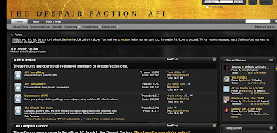
In the initial stages, we heavily relied on Internet searches to put us on the right track in terms of looking at audience research and analysis of existing music videos. In this regard, such commonly-known websites as Google and Youtube were our de facto websites of choice to search for such resources, such as music videos to analyse, album covers to look at and use to construct a mood board for our own digipak design, and websites such as http://www.uktribes.com/ and the Despair Faction forum (the official AFI fan forum/fan club) were useful for us in our early audience research. Below are screengrabs of both the UK Tribes website and the Despair Faction homepage.
What proved also to be a valuable tool in the early stages, especially with regards to location scouting, came the Google Maps tool. With this, we were able to scout around prospective narrative locations, and also navigate a route for the performers and crew to make it to the performance location. It was by using this tool that we found that the Klinger building, as well as an old laundry building in Swanley, would be perfect locations for narrative filming. What this did do is save us time in scouting for the location itself on foot or having to try and find such locations on foot in such a manner. However, it's limitations were shown up when we arrived at the Klinger building to potentially shoot the narrative section, and building work was commencing on it, rendering it out of action for us. The same story occurred for the laundry - in fact, when we arrived, the entire site had been bulldozed and a new housing estate was being built! This is obviously the limitation of the software - that it is, indeed, often not exactly up to date. Below is a screenshot of the Google Maps software showing the Klinger building.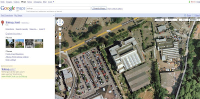
When it came to the filming itself, we used a standard Sony Handycam video camera, making usage of DV tapes, used in conjunction with the tripod and other equipment (see previous posts relating to Equipment). We used DV tapes as opposed to a camera with an in-built disc storage because we were safe in the knowledge that the tape format would work fine with the computers we were to use to edit, and there would be no problems with transferring the footage from tape to computer, whereas we had heard some horror stories about whole swathes of footage being rendered unusable by a format error or an incompatibility problem with cameras with inbuilt storage.
Our editing program was always going to be Final Cut Pro, readily accessible in the Media Suite in our school facilities. It offered everything we needed - extensive timelines to place multiple clips on top of one another, extensive editing options (including the letterbox cropping and colour overlay effect that was so pivotal to our video), and it was readily compatible with our cameras and tape footage right off the bat. There are alternatives we could have used, such as Adobe Premiere, or iMovie software, or even the most basic option, Windows Movie Maker, but I know from first-hand experience (in the case of Premiere and Windows Movie Maker) that none of the above software packages have nearly as much scope for potential editing and ease of working as Final Cut Pro, and I'm fairly sure we would have struggled to formulate our video as well as we did had we not had Final Cut at our disposal. Below is a screenshot which shows the full workspace of Final Cut, and the wide variety of options available.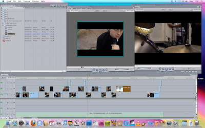 Below are several links to posts where I outline in great detail which elements and tools we used in Final Cut to construct our video.
Video Editing
Final Cut Editing
One source of inspiration which actually needs to be mentioned is in fact the previous school year's A2 coursework itself. Before the start of our course, we were shown the previous year's work, and it provided a real inspiration for us, as some of the videos in particular were very well made and looked fantastic. Not only did they provide us with this motivation, but they also directly inspired some of our work, in terms of use of lighting, performers, and making best use of the equipment we had at our disposal.
For the ancillary tasks, there was only going to be one software platform we would use - Adobe Photoshop (CS4 edition in our case). Simiiarly to Final Cut for film editing, Photoshop just offers such a wide range of options, and there is virtually no limits in terms of what you can create or edit on there, so it was an obvious choice to use for the ancillary tasks. Below are links to three posts where I outline in detail how exactly we used Photoshop CS4 to construct the ancillary tasks using the software to it's full potential.
Digipak Construction 1
Digipak Construction 2
Digipak Construction 3
Magazine Advert Construction
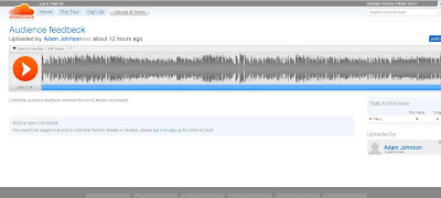
We made use of several important websites to host our work for usage in the blog posting. Firstly, we utilised the video hosting website Vimeo for hosting our various videos, including the animatic, rough cut and final cuts, and the option the Vimeo video player has of being able to be embedded in other web pages or our blog posts was incredibly useful. Similarly so was that of the sound file hosting website Soundcloud, which we used to host our audience feedback interview file. This has a similar embeddable player, which we used to post up the interview in our blogs. Below are screengrabs of our work appearing as it would on the Vimeo and Soundcloud websites, respectively.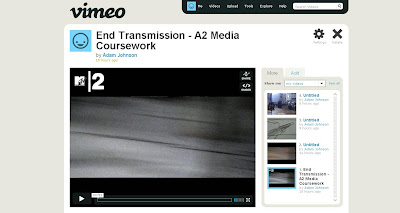
Finally, in the Feedback stage, we used several different methods of gaining feedback from viewers. We used the video camera to record the audio interviews, and simply cut the video section out when we transferred the clips to the computer, and saved them down as audio (.m4a) files. We also used the Windows Live Messanger social networking software program to show people the video and gather their thoughts via that.
This concludes Question 4.
In the initial stages, we heavily relied on Internet searches to put us on the right track in terms of looking at audience research and analysis of existing music videos. In this regard, such commonly-known websites as Google and Youtube were our de facto websites of choice to search for such resources, such as music videos to analyse, album covers to look at and use to construct a mood board for our own digipak design, and websites such as http://www.uktribes.com/ and the Despair Faction forum (the official AFI fan forum/fan club) were useful for us in our early audience research. Below are screengrabs of both the UK Tribes website and the Despair Faction homepage.


What proved also to be a valuable tool in the early stages, especially with regards to location scouting, came the Google Maps tool. With this, we were able to scout around prospective narrative locations, and also navigate a route for the performers and crew to make it to the performance location. It was by using this tool that we found that the Klinger building, as well as an old laundry building in Swanley, would be perfect locations for narrative filming. What this did do is save us time in scouting for the location itself on foot or having to try and find such locations on foot in such a manner. However, it's limitations were shown up when we arrived at the Klinger building to potentially shoot the narrative section, and building work was commencing on it, rendering it out of action for us. The same story occurred for the laundry - in fact, when we arrived, the entire site had been bulldozed and a new housing estate was being built! This is obviously the limitation of the software - that it is, indeed, often not exactly up to date. Below is a screenshot of the Google Maps software showing the Klinger building.

When it came to the filming itself, we used a standard Sony Handycam video camera, making usage of DV tapes, used in conjunction with the tripod and other equipment (see previous posts relating to Equipment). We used DV tapes as opposed to a camera with an in-built disc storage because we were safe in the knowledge that the tape format would work fine with the computers we were to use to edit, and there would be no problems with transferring the footage from tape to computer, whereas we had heard some horror stories about whole swathes of footage being rendered unusable by a format error or an incompatibility problem with cameras with inbuilt storage.
Our editing program was always going to be Final Cut Pro, readily accessible in the Media Suite in our school facilities. It offered everything we needed - extensive timelines to place multiple clips on top of one another, extensive editing options (including the letterbox cropping and colour overlay effect that was so pivotal to our video), and it was readily compatible with our cameras and tape footage right off the bat. There are alternatives we could have used, such as Adobe Premiere, or iMovie software, or even the most basic option, Windows Movie Maker, but I know from first-hand experience (in the case of Premiere and Windows Movie Maker) that none of the above software packages have nearly as much scope for potential editing and ease of working as Final Cut Pro, and I'm fairly sure we would have struggled to formulate our video as well as we did had we not had Final Cut at our disposal. Below is a screenshot which shows the full workspace of Final Cut, and the wide variety of options available.
 Below are several links to posts where I outline in great detail which elements and tools we used in Final Cut to construct our video.
Video Editing
Final Cut Editing
One source of inspiration which actually needs to be mentioned is in fact the previous school year's A2 coursework itself. Before the start of our course, we were shown the previous year's work, and it provided a real inspiration for us, as some of the videos in particular were very well made and looked fantastic. Not only did they provide us with this motivation, but they also directly inspired some of our work, in terms of use of lighting, performers, and making best use of the equipment we had at our disposal.
For the ancillary tasks, there was only going to be one software platform we would use - Adobe Photoshop (CS4 edition in our case). Simiiarly to Final Cut for film editing, Photoshop just offers such a wide range of options, and there is virtually no limits in terms of what you can create or edit on there, so it was an obvious choice to use for the ancillary tasks. Below are links to three posts where I outline in detail how exactly we used Photoshop CS4 to construct the ancillary tasks using the software to it's full potential.
Digipak Construction 1
Digipak Construction 2
Digipak Construction 3
Magazine Advert Construction
We made use of several important websites to host our work for usage in the blog posting. Firstly, we utilised the video hosting website Vimeo for hosting our various videos, including the animatic, rough cut and final cuts, and the option the Vimeo video player has of being able to be embedded in other web pages or our blog posts was incredibly useful. Similarly so was that of the sound file hosting website Soundcloud, which we used to host our audience feedback interview file. This has a similar embeddable player, which we used to post up the interview in our blogs. Below are screengrabs of our work appearing as it would on the Vimeo and Soundcloud websites, respectively.


Finally, in the Feedback stage, we used several different methods of gaining feedback from viewers. We used the video camera to record the audio interviews, and simply cut the video section out when we transferred the clips to the computer, and saved them down as audio (.m4a) files. We also used the Windows Live Messanger social networking software program to show people the video and gather their thoughts via that.
This concludes Question 4.
Evaluation - Question 3
What have you learned from your audience feedback?
The process of gaining and analysing audience feedback was an interesting process, where we gathered a range of both positive and negative comments. What made it very interesting was the fact that we heard opinions or points of view that we had either not spotted or not considered. We gathered feedback in a variety of ways - our main method was to simply gather people round for a viewing of our rough cut, then taking them away and interviewing them individually. As the majority of these initial interviewees were fellow media students like ourselves, they were able to offer us a strong critical perspective on the rough cut and how we could improve. Below is a copy of the interview answers we received.
Audience feedbeck by Adam Johnson
From this we looked at the feedback and found the following points: On the positive side:
Negative points included:
We also sent out a questionnaire to several people who had a chance to watch the video having been linked to it via email, and their responses are posted below as filled out questionnaires:
Response 1 was from an underground rapper, Shola Williams, who has experience of having cameo roles in several high-production music videos, so therefore he has great experience in this field. Here was his opinion, shown through the feedback sheet sent to him by Josh: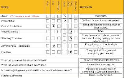
Response 2 came from Jordan Saville, a fellow media student. Here was his feedback sheet response: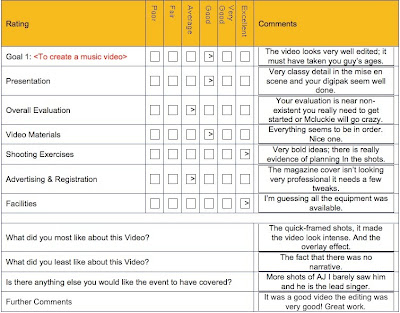
We also gathered general feedback in a more orthodox fashion. I spread the link to the video out on the Windows Live Messanger social networking program, and via this I gained two responses, both from non-media students and massive AFI fans - Dave Clark and Ben Smith. Dave commented that it is a 'great vid, great camera work' with 'nice changes' (cuts between shots), and the only bad point being the 'slightly off lip synch' at one point in the video. Ben said that it was 'very good' with his only criticism being that, in the intro section, the 'drums seem different, out of place somehow'. But otherwise he said that it was 'top notch', praised the camera work and said it looked of 'very professional quality'.
One last piece of feedback we did recieve was from our media teacher, Ms Mcluckie herself, which focused on the blurred shots in the bridge - she believed that they were out of place and perhaps should be removed. But otherwise, she liked the video and the direction in which it was going.
What pleased us all beyond measure were the compliments we recieved about how it looked professional, as this demonstrated to us that our audience appeared to believe that our video looked like a credible media product. This is the best compliment we could have received, and to have it mentioned more than once is hugely satisfying. We registered very quickly that there was also an almost universal opinion that the singer wasn't given enough screen time, but sadly this wasn't something we could rectify easily, because a) there was a shortage of strong footage we could use of the singer, and b) it was an intention of ours that the band members would all get equal billing, and that there would be less of a dominance of the screen by the singer than most rock music videos, where the singer almost bosses the screen often to the detriment of the rest of the band. We wished to subvert this, though it appear we may have gone too far the other way. We were also sadly unable to really film many full band shots due to the nature of our location, with lots of undue props in the background, meant we couldn't get a real full shot of the band and had to rely on the fast cuts between individual members. Fortunately, nearly all the criticism that we encountered was minor, and they were small points which we could correct if necessary - flatteringly, most of the feedback was very, very positive, which confirmed to us that we were definatly heading in the right direction with our video.
This concludes Question 3.
The process of gaining and analysing audience feedback was an interesting process, where we gathered a range of both positive and negative comments. What made it very interesting was the fact that we heard opinions or points of view that we had either not spotted or not considered. We gathered feedback in a variety of ways - our main method was to simply gather people round for a viewing of our rough cut, then taking them away and interviewing them individually. As the majority of these initial interviewees were fellow media students like ourselves, they were able to offer us a strong critical perspective on the rough cut and how we could improve. Below is a copy of the interview answers we received.
Audience feedbeck by Adam Johnson
From this we looked at the feedback and found the following points: On the positive side:
- At least 2 mentions were made to the settings
- 6 references were made to the strength of the editing, and how it matched the energy and pace of the song,
- 3 points were made about the good use of lighting
- 3 points were made about the effective use of whip pan cuts between shots
- 2 people made the point that the video overall had a very distinctive style
- 2 people commented that the video looked professionally made
- 2 people noted the strength of the colour overlay effect.
Negative points included:
- 3 people made the point that there perhaps wasn't enough screen time given to the singer
- 2 people mentioned that there was perhaps slightly too much focus on the instruments as opposed to the people playing them
- 3 people mentioned that the whip pans were perhaps overused and sometimes caused the viewer to feel a little disorientated
- 2 people commented that they would have liked to have seen more shots of the whole band as one, rather than individual shots of each member at any one time.
We also sent out a questionnaire to several people who had a chance to watch the video having been linked to it via email, and their responses are posted below as filled out questionnaires:
Response 1 was from an underground rapper, Shola Williams, who has experience of having cameo roles in several high-production music videos, so therefore he has great experience in this field. Here was his opinion, shown through the feedback sheet sent to him by Josh:

Response 2 came from Jordan Saville, a fellow media student. Here was his feedback sheet response:

We also gathered general feedback in a more orthodox fashion. I spread the link to the video out on the Windows Live Messanger social networking program, and via this I gained two responses, both from non-media students and massive AFI fans - Dave Clark and Ben Smith. Dave commented that it is a 'great vid, great camera work' with 'nice changes' (cuts between shots), and the only bad point being the 'slightly off lip synch' at one point in the video. Ben said that it was 'very good' with his only criticism being that, in the intro section, the 'drums seem different, out of place somehow'. But otherwise he said that it was 'top notch', praised the camera work and said it looked of 'very professional quality'.
One last piece of feedback we did recieve was from our media teacher, Ms Mcluckie herself, which focused on the blurred shots in the bridge - she believed that they were out of place and perhaps should be removed. But otherwise, she liked the video and the direction in which it was going.
What pleased us all beyond measure were the compliments we recieved about how it looked professional, as this demonstrated to us that our audience appeared to believe that our video looked like a credible media product. This is the best compliment we could have received, and to have it mentioned more than once is hugely satisfying. We registered very quickly that there was also an almost universal opinion that the singer wasn't given enough screen time, but sadly this wasn't something we could rectify easily, because a) there was a shortage of strong footage we could use of the singer, and b) it was an intention of ours that the band members would all get equal billing, and that there would be less of a dominance of the screen by the singer than most rock music videos, where the singer almost bosses the screen often to the detriment of the rest of the band. We wished to subvert this, though it appear we may have gone too far the other way. We were also sadly unable to really film many full band shots due to the nature of our location, with lots of undue props in the background, meant we couldn't get a real full shot of the band and had to rely on the fast cuts between individual members. Fortunately, nearly all the criticism that we encountered was minor, and they were small points which we could correct if necessary - flatteringly, most of the feedback was very, very positive, which confirmed to us that we were definatly heading in the right direction with our video.
This concludes Question 3.
Evaluation - Question 2
How effective is the combination of your main product and ancillary texts?
Here I will look at the linking characteristics and house style across the three media products and demonstrate just how effective they are at forming a cohesive promotional package, as well as linking together and targeting the desired audience we are looking for, which is largely made up of AFI's existing fans, as well as teenage rock fans in general.
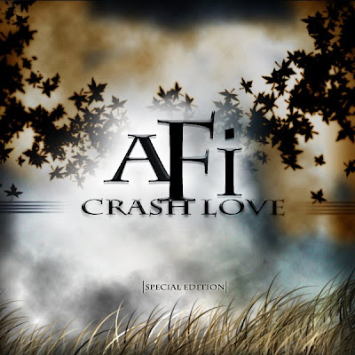
Firstly, I will place side-by-side a screengrab from the finished music video with the front cover of the digipak.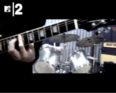
What this does is expand on the mode of address and overall theme, and is commonplace in real album promotion - bands regularly tour in support of albums; indeed, AFI themselves are touring in support of the Crash Love album as I type.
To conclude, I am very happy with the overall image projected by our package, across the three products. The only part I would change is to perhaps add in at least a partial narrative section - it was sad to have to give that section up, and it would help to link the three products further in a narrative sense. But otherwise, I am very happy and proud with how the products have all come out, and am confident they will stand up in a real-world context.
This concludes Question 2.
Here I will look at the linking characteristics and house style across the three media products and demonstrate just how effective they are at forming a cohesive promotional package, as well as linking together and targeting the desired audience we are looking for, which is largely made up of AFI's existing fans, as well as teenage rock fans in general.
Firstly, I will place side-by-side a screengrab from the finished music video with the front cover of the digipak.


It is when we place the two products side by side that the common style becomes more apparent, and it is mainly in the 'cold' feel to the colours - with the greys and blacks linking together to give a cool, emotionally downing feeling to both products. What is also interesting, however, is how they represent this feeling - the music video uses a bleak, industrial feel to create the feeling of cold emotion, whereas the album cover uses the dark, rolling clouds and almost unlimited space and fantasy setting to give it a dark feel. The industrial, gritty locale of the music video gives viewers and the target audience something to relate to, as such buildings and gritty, urbane looking areas, and the album cover itself acts as a form of escapism for them - the unlimited cloudscape gives the audience and fans free reign as to what exactly it means or represents - for us, we wanted to give the artwork a real feeling of mystery, of escape, of darkness, and of romance to a degree. What is interesting is how the album artwork was influenced heavily by the original plan for the narrative section in the music video, which was eventually canned. What this creates with the album artwork is a sense of narrative in the artwork itself, but instead of having it pre-defined, it simply sets out several themes through the artwork and the title (love, death, fantasy, mystery etc) and is much more open-ended. This also directly appeals to the target audience of young rock fans, as well as appealing to both male and female fans - normally in modern rock, bands can sometimes be often very 'macho' and male-orientated, but we have avoided this issue here.It is also for this reason that we avoided showing the band themselves on the album artwork, instead trading on the content of the lyrics and the music.
The romantic feel of it is further emphasised by the font, Charlemagne ST, which not only matches the look of the artwork but also links closely to the band themselves, who have often used elegant and smart fonts such as this - this therefore links back to the existing fans.
I have yet to mention about the magazine advert so far, and there is a good reason for this - the magazine advert was always going to be an extensive of the album cover artwork. As this may well be the first thing that fans and the audience would see of the new album before actually buying the album, the advert and promotional material needs to give a preview to the audience and prospective viewers of what to expect and what they will find in the new album, and the music video is an extension of that. Below is our magazine advert, and as you can see, it uses the same concept and artwork as the album cover itself.
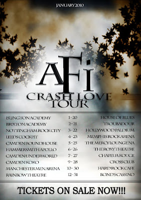
What also must be noted is how we added extra elements into the overall promotion package for the album, which matches real-world practices for it. Below are these examples: the regular, single-CD album cover and the tour poster.
The romantic feel of it is further emphasised by the font, Charlemagne ST, which not only matches the look of the artwork but also links closely to the band themselves, who have often used elegant and smart fonts such as this - this therefore links back to the existing fans.
I have yet to mention about the magazine advert so far, and there is a good reason for this - the magazine advert was always going to be an extensive of the album cover artwork. As this may well be the first thing that fans and the audience would see of the new album before actually buying the album, the advert and promotional material needs to give a preview to the audience and prospective viewers of what to expect and what they will find in the new album, and the music video is an extension of that. Below is our magazine advert, and as you can see, it uses the same concept and artwork as the album cover itself.

What also must be noted is how we added extra elements into the overall promotion package for the album, which matches real-world practices for it. Below are these examples: the regular, single-CD album cover and the tour poster.


What this does is expand on the mode of address and overall theme, and is commonplace in real album promotion - bands regularly tour in support of albums; indeed, AFI themselves are touring in support of the Crash Love album as I type.
To conclude, I am very happy with the overall image projected by our package, across the three products. The only part I would change is to perhaps add in at least a partial narrative section - it was sad to have to give that section up, and it would help to link the three products further in a narrative sense. But otherwise, I am very happy and proud with how the products have all come out, and am confident they will stand up in a real-world context.
This concludes Question 2.
Evaluation - Question 1, Part 3
This final part of Question 1 will look at the mise-en-scene and location of the performance shoot, and how this plays a huge part in the look and feel of our video, as well as a brief look at the relationships between the performers on-screen.
First, let's take a look at the location - the warehouse in which we shot the video. Below is a nice shot which really captures the corrugated metal roofing of the warehouse.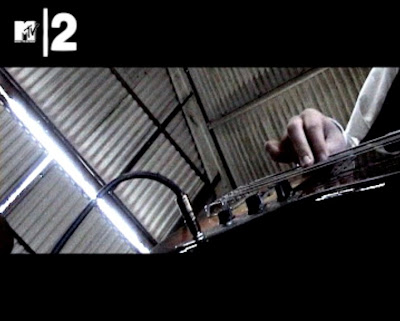
Now, you can see here how the cold grey colour of the warehouse itself seems to match in when the colour overlay has been applied in such a manner, and the tough, almost industrial, look to the surroundings does match the performance shoot style, with the silvers and blacks of the equipment and instruments blending in nicely. It helps to build the overall feeling of coldness which we really hoped to get from the song. Now, warehouses aren't tremendously prevelant in rock music videos, but the idea of gritty, industrial-type locations is, however. Below are two examples: The Offspring's 'Gone Away' video and Linkin Park's 'One Step Closer' video.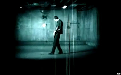
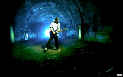
As is evidenced by these shots, the cold greys and dark, dull colours do help to accentuate any light that is around, so therefore, the natural light coming through the gap in the door of the warehouse in our video glows a little more, and a similar effect is achieved in the Gone Away video with the swinging lightbulb. It also perfectly suits our colour overlay modification, as the already cold surroundings are further emphasised and blended in with the performers and instruments to give an all-over cold, emotionally downing look.
The one variation we included in our video from the location was the inclusion of the battered wood boards on the floor of the performance, as can be seen clearly in these shots.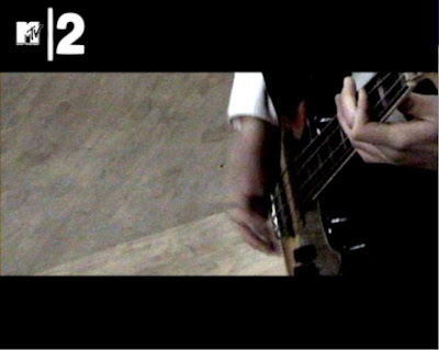
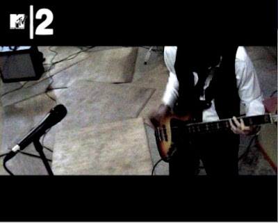
Now this is more unusual, but we decided this would help us give our a video a slightly more unique look, whilst still adding more to the cold, battered, gritty feel of the location. It was a spur-of-the-moment thing to include the boards, and I'm glad we did - they really do add a little unique slant to our location, without, as I say, taking anything away from the rest of the location and the cold, industrial vibes.
Another type of shot, seen very frequently in rock music videos, that we decided to use more sparingly, are shots where two or more performers are shown, with one performer in clear focus with perhaps others in the background. One video where it is used frequently is the video for 'No One Knows' by Queens of the Stone Age, and some exemplar shots are shown below.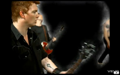
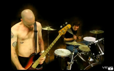
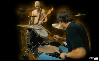
What this does is give a heightened sense of spacial awareness, and gives a sense that the performers are tightly-knit and all playing close together, as well as having a telepathic link to each other as a band, performing as a true unit. It also does give a sense of heightened importance to the performer in the foreground, almost like he or she is leading the rest of the band. Below are several examples of it's usage in our video.
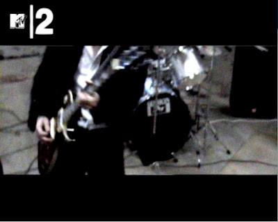
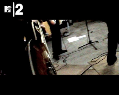
In conclusion, our video uses lots of already existing media conventions of a rock music video, but subtly alters and challenges some of them and successfully manages to mix established traditions and conventions of music videos with a unique look and style we have created with our video.
This concludes Question 1.
First, let's take a look at the location - the warehouse in which we shot the video. Below is a nice shot which really captures the corrugated metal roofing of the warehouse.

Now, you can see here how the cold grey colour of the warehouse itself seems to match in when the colour overlay has been applied in such a manner, and the tough, almost industrial, look to the surroundings does match the performance shoot style, with the silvers and blacks of the equipment and instruments blending in nicely. It helps to build the overall feeling of coldness which we really hoped to get from the song. Now, warehouses aren't tremendously prevelant in rock music videos, but the idea of gritty, industrial-type locations is, however. Below are two examples: The Offspring's 'Gone Away' video and Linkin Park's 'One Step Closer' video.


As is evidenced by these shots, the cold greys and dark, dull colours do help to accentuate any light that is around, so therefore, the natural light coming through the gap in the door of the warehouse in our video glows a little more, and a similar effect is achieved in the Gone Away video with the swinging lightbulb. It also perfectly suits our colour overlay modification, as the already cold surroundings are further emphasised and blended in with the performers and instruments to give an all-over cold, emotionally downing look.
The one variation we included in our video from the location was the inclusion of the battered wood boards on the floor of the performance, as can be seen clearly in these shots.


Now this is more unusual, but we decided this would help us give our a video a slightly more unique look, whilst still adding more to the cold, battered, gritty feel of the location. It was a spur-of-the-moment thing to include the boards, and I'm glad we did - they really do add a little unique slant to our location, without, as I say, taking anything away from the rest of the location and the cold, industrial vibes.
Another type of shot, seen very frequently in rock music videos, that we decided to use more sparingly, are shots where two or more performers are shown, with one performer in clear focus with perhaps others in the background. One video where it is used frequently is the video for 'No One Knows' by Queens of the Stone Age, and some exemplar shots are shown below.


What this does is give a heightened sense of spacial awareness, and gives a sense that the performers are tightly-knit and all playing close together, as well as having a telepathic link to each other as a band, performing as a true unit. It also does give a sense of heightened importance to the performer in the foreground, almost like he or she is leading the rest of the band. Below are several examples of it's usage in our video.


In conclusion, our video uses lots of already existing media conventions of a rock music video, but subtly alters and challenges some of them and successfully manages to mix established traditions and conventions of music videos with a unique look and style we have created with our video.
This concludes Question 1.
Evaluation - Question 1, Part 2
I will start Part 2 by looking at a very common technique seen in countless rock music videos, as well as music videos in other genres - prevalent shots of the performers and the instruments being played.
Now, there are three mild variations on this, often all being used in the same video at once. The first type revolves around showing both the performer and the instrument being played all in one shot, to show complete movement of the performer and show him/her in complete control of the instrument. Below is an example from our video.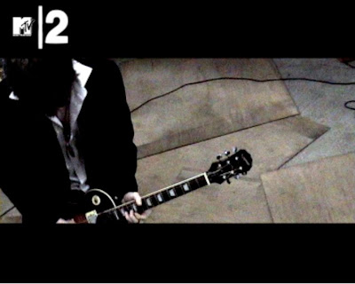
The majority of the guitarist is shown in this shot, showing his movement and energy in playing the song, as well as the full extent of his clothing. The upturned collar, and the undone top buttons on the shirt showing a great mix of smart attire and very casual appearance and demeanour. The colour overlay is in evidence again here, as you can see the sunburst colour of the guitar is minimised and darkened. The advantage of using a full shot such as this means that the viewer can see the performer's emotion in playing along with his technical skill and proficiency with the instrument in relation to one another. Below are a few more examples of this, the first coming from Green Day's 'American Idiot' video and the second coming from Rise Against's 'Re-Education (Through Labor)' video.

The one tradition we do break from here, as you can see from the example shots, is that these shots commonly seem to use low-angle shots, to give the performers a sense of real presence and dominance. We revert this by using high-angle shots predominantly to give a greater sense of space and a feeling that the viewer is almost like a 'fly-on-the-wall' to this performance. However, as you will see when I continue on to the other types of performer shots, we do use low-angle shots more prevalently.
Speaking of which, I'll now move on to the second variation - extreme close-ups of the performer's instruments and the performers actually playing them. Below are multiple examples from our music video, involving the guitarist, bassist and drummer.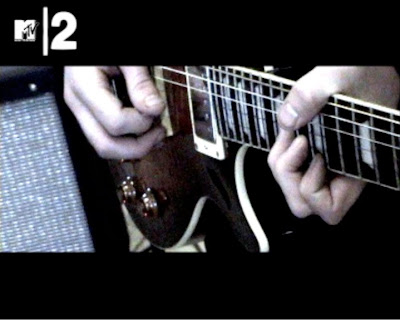
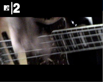
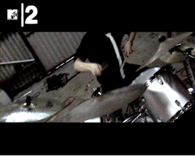
This is another record company driven convention, mainly, and it is understandable, as it is designed to show that the performers have high levels of technical proficiency with their instruments. By showing close-ups of the performer's hands playing the instruments, this demonstrates high-energy and technically skilled playing of the instruments. Below are several more examples from our video of this technique.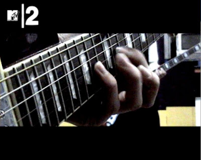
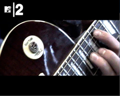
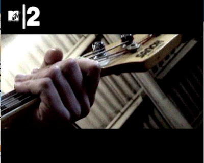
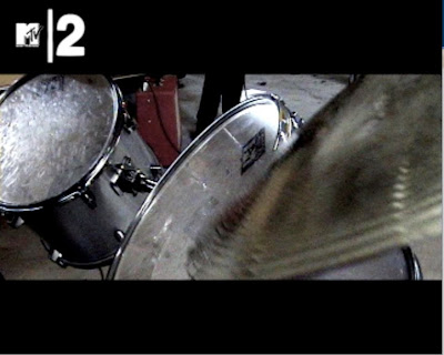
These shots, particularly in this case the close-up shots of the fretting of the solo section and the close-up shot of the cymbal being hit, can serve a dual purpose - not only can show technical skill, as mentioned above, but they can also be used to emphasise certain aspects of the song; for example, the close-up of the fretting of the guitar can emphasise the solo and the skill of it, and the close-up of the cymbal being hit hard can be used to effectively accentuate crashes and transitions in the song, by using quick cuts and fleeting shots right on the beat. Below is a real-world example of this type of shot, which has been taken from the music video to Bad Religion's 'New Dark Ages'.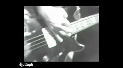
The third and final variation on this type of shot are shots focusing entirely on the performer's face, with maybe some snatches of their instrument in the shot too, but the main focus of the shot is centred entirely on the performer's face to show the emotion in his face. Here are several examples from our video of this type of shot: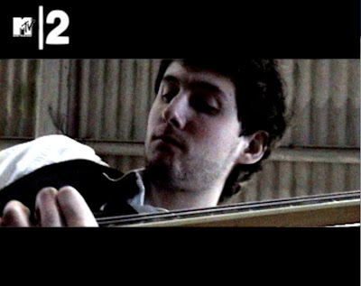
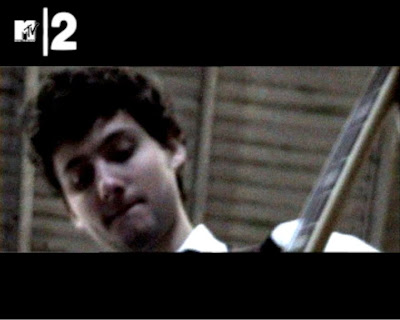
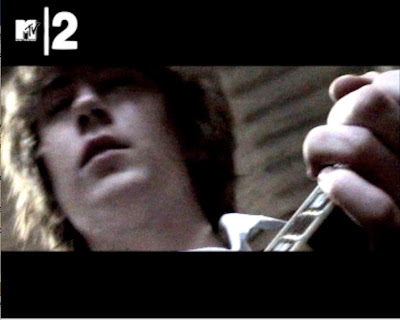
As you can see, this accurately portrays the performer's emotions when playing the song. There are definitely differing emotions and body languages in the performers; in my mind, the bassist looks like he is calmly focused on the performance and playing of his instrument, and the guitarist fits his clothing style, in that he looks cool, casual and unflustered. Now, what is important here is to reflect on the emotions - although the song is energetic and rocking to a certain extent, there is still an element of atmosphere and mild restraint, significantly in certain parts of the song, such as the verses and the bridge - it is the sort of song where the blasts of pure all-out energy are not common across the entire song, but the energy ebbs and flows, and increases the impact of the high-energy sections of the song. Ergo, it is important that a degree of restraint is shown by the other members, as the singer, as we have already seen, is an energy-charged frontman, so therefore this must be tempered by his fellow bandmates.
That concludes Part 2.
Now, there are three mild variations on this, often all being used in the same video at once. The first type revolves around showing both the performer and the instrument being played all in one shot, to show complete movement of the performer and show him/her in complete control of the instrument. Below is an example from our video.

The majority of the guitarist is shown in this shot, showing his movement and energy in playing the song, as well as the full extent of his clothing. The upturned collar, and the undone top buttons on the shirt showing a great mix of smart attire and very casual appearance and demeanour. The colour overlay is in evidence again here, as you can see the sunburst colour of the guitar is minimised and darkened. The advantage of using a full shot such as this means that the viewer can see the performer's emotion in playing along with his technical skill and proficiency with the instrument in relation to one another. Below are a few more examples of this, the first coming from Green Day's 'American Idiot' video and the second coming from Rise Against's 'Re-Education (Through Labor)' video.


The one tradition we do break from here, as you can see from the example shots, is that these shots commonly seem to use low-angle shots, to give the performers a sense of real presence and dominance. We revert this by using high-angle shots predominantly to give a greater sense of space and a feeling that the viewer is almost like a 'fly-on-the-wall' to this performance. However, as you will see when I continue on to the other types of performer shots, we do use low-angle shots more prevalently.
Speaking of which, I'll now move on to the second variation - extreme close-ups of the performer's instruments and the performers actually playing them. Below are multiple examples from our music video, involving the guitarist, bassist and drummer.


This is another record company driven convention, mainly, and it is understandable, as it is designed to show that the performers have high levels of technical proficiency with their instruments. By showing close-ups of the performer's hands playing the instruments, this demonstrates high-energy and technically skilled playing of the instruments. Below are several more examples from our video of this technique.


These shots, particularly in this case the close-up shots of the fretting of the solo section and the close-up shot of the cymbal being hit, can serve a dual purpose - not only can show technical skill, as mentioned above, but they can also be used to emphasise certain aspects of the song; for example, the close-up of the fretting of the guitar can emphasise the solo and the skill of it, and the close-up of the cymbal being hit hard can be used to effectively accentuate crashes and transitions in the song, by using quick cuts and fleeting shots right on the beat. Below is a real-world example of this type of shot, which has been taken from the music video to Bad Religion's 'New Dark Ages'.

The third and final variation on this type of shot are shots focusing entirely on the performer's face, with maybe some snatches of their instrument in the shot too, but the main focus of the shot is centred entirely on the performer's face to show the emotion in his face. Here are several examples from our video of this type of shot:


As you can see, this accurately portrays the performer's emotions when playing the song. There are definitely differing emotions and body languages in the performers; in my mind, the bassist looks like he is calmly focused on the performance and playing of his instrument, and the guitarist fits his clothing style, in that he looks cool, casual and unflustered. Now, what is important here is to reflect on the emotions - although the song is energetic and rocking to a certain extent, there is still an element of atmosphere and mild restraint, significantly in certain parts of the song, such as the verses and the bridge - it is the sort of song where the blasts of pure all-out energy are not common across the entire song, but the energy ebbs and flows, and increases the impact of the high-energy sections of the song. Ergo, it is important that a degree of restraint is shown by the other members, as the singer, as we have already seen, is an energy-charged frontman, so therefore this must be tempered by his fellow bandmates.
That concludes Part 2.
Evaluation - Question 1, Part 1
In what ways does your media product use, develop or challenge forms and conventions of real media products?
Our project was an entire promotional package for a new rock music album by the band AFI, with the central focus being on creating a promotional music video for the first single for the album to be sent out to all major music video channels (MTV, Kerrang!, Scuzz, etc.). Within this, there were many conventions of existing music videos that we followed, but equally, there are also certain conventions that we challenged in order to create something unique and truly set it that much apart from videos and media products typical of the rock music genre. We were careful to balance this line between following established conventions and breaking away a little and doing our own thing, and I'm very happy to report that, in my opinion, I believe we achieved this well. I will look at a number of different shots from the video which illustrate this, starting with the first one below. I will also draw in other shots from throughout the video which are similar or help illustrate the point, as well as shots from existing music videos of the genre, to show how we have either followed or challenged existing conventions.
In this shot, the colour overlay effect can really be evidenced for the first time, giving the concrete floor a really cold feel to it, which matches back to our genre of music - not necessarily the rock music genre, but more the goth music genre, of which AFI are a part of. Below are two examples of using the microphone shot I explained above in existing videos, the first shot being from AFI's 'Medicate' video, and the second taken from the music video to The Offspring's 'Gone Away'.
Next, I will take a look at several shots of the lead singer. It is a common convention of music videos across the genres that the record companies often demand lots of shots of the lead singer in a band, sometimes to the detriment of the rest of the band. The point of this is that the lead singer is often the main focal point of the band to the media and in promotion, so heavy exposure of him is often requested in videos. Below is one shot in particular of the singer.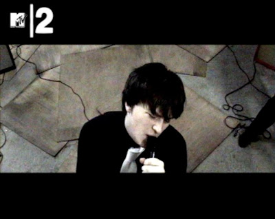
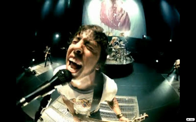
This shot demonstrates several key conventions. Not only does it follow the convention I outlined a moment ago, but it also uses several others, chief of which is that of the singer showing real emotion in his or her singing. As you can see here, the singer is so immersed in the song itself that his eyes are closed and he gives a sense that he is almost lost in the song itself, further emphasised by his body language as he clutches the microphone. Below is another shot showing an example of the energy exuding from the singer, as he moves his body frantically in time to the music.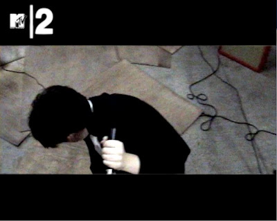 Also, the high-angle shot down onto the singer is a classic rock music camera angle, and it allows the viewer to show the movement and energy of the singer well. Below are several examples of this, including another shot from the 'Medicate' video, and two other examples: Foo Fighters' 'All My Life' and The Offspring's 'Can't Get My Head Around You', two other modern rock music videos.
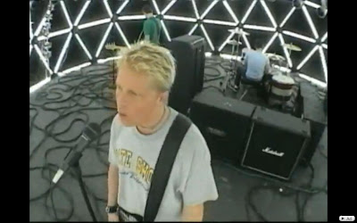
What these shots of the singer also show are the wooden boards that we laid on the floor for the shooting, and they really come into the fore in these high-angle shots. They further emphasise the already gritty, quite cold look that has been achieved by the grey concrete of the floor and the colour overlay we implemented. Also, leads and other equipment are sighted in the background of these shots, which gives the viewer a certain spacial awareness - it demonstrates the size of the area that the band are performing in, and by keeping the band relatively close together, it shows an intimacy, unity and tightness to the band and their performance. Below is another high-angle shot which demonstrates this well, showing the drummer and other members.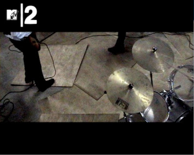
Another shot relating to the singer is this shot here, showing a close up of the singer and in particular, his mouth. This is another relatively common technique, and further emphasises the emotion and energy evident in the singer's performance. However, we did go against this convention to a certain degree, as it is often more common to show the whole face in a portrait format - in our video, however, we show mainly the mouth, along with parts of the upper body, in order to show the flamboyant movement of the singer's arm in time to the lyrics and the song.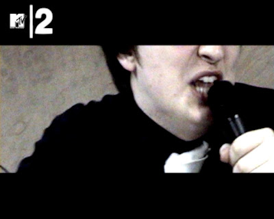
Emotion is prevalent in the other performers too, as this shot of the bassist shouting backing vocals with real vigour demonstrates. This helps to add to the backing vocals and give them more size and energy than normal, even though there is no actual difference to the backing vocals on the song. It embellishes them with more energy, and it keeps a unity to the band by using a similar camera angle as the singer. Below is the shot in question, and below that is an example of this technique in the video for AFI's song 'Miss Murder', where the bassist is shown furiously shouting the 'Hey!' in the chorus section.
This concludes Part 1 of Question 1.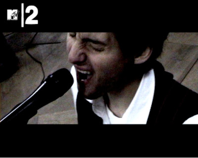

Our project was an entire promotional package for a new rock music album by the band AFI, with the central focus being on creating a promotional music video for the first single for the album to be sent out to all major music video channels (MTV, Kerrang!, Scuzz, etc.). Within this, there were many conventions of existing music videos that we followed, but equally, there are also certain conventions that we challenged in order to create something unique and truly set it that much apart from videos and media products typical of the rock music genre. We were careful to balance this line between following established conventions and breaking away a little and doing our own thing, and I'm very happy to report that, in my opinion, I believe we achieved this well. I will look at a number of different shots from the video which illustrate this, starting with the first one below. I will also draw in other shots from throughout the video which are similar or help illustrate the point, as well as shots from existing music videos of the genre, to show how we have either followed or challenged existing conventions.
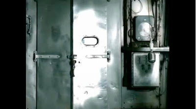
To start, lets have a look at this shot of the microphone from the very start of the video. 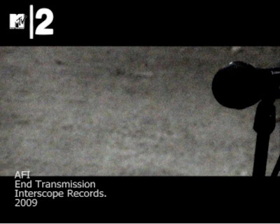
A shot of solely the microphone is a classic shot featured in many rock performance videos, and is often used, occasionally with shots of the equipment around the band, to set the scene and introduce to the viewer that it will be a performance video. It also gives the mise-en-scene (in this case, the equipment) a certain energy about it, and a sense of anticipation that, at any second, the performance will kick in and the performers (which we haven't seen directly yet in the video) will crash into life. Below is another shot taken from the start of our video, this time of the guitarist's amp from a high-angle shot.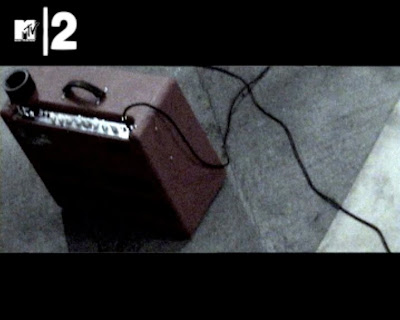

A shot of solely the microphone is a classic shot featured in many rock performance videos, and is often used, occasionally with shots of the equipment around the band, to set the scene and introduce to the viewer that it will be a performance video. It also gives the mise-en-scene (in this case, the equipment) a certain energy about it, and a sense of anticipation that, at any second, the performance will kick in and the performers (which we haven't seen directly yet in the video) will crash into life. Below is another shot taken from the start of our video, this time of the guitarist's amp from a high-angle shot.

In this shot, the colour overlay effect can really be evidenced for the first time, giving the concrete floor a really cold feel to it, which matches back to our genre of music - not necessarily the rock music genre, but more the goth music genre, of which AFI are a part of. Below are two examples of using the microphone shot I explained above in existing videos, the first shot being from AFI's 'Medicate' video, and the second taken from the music video to The Offspring's 'Gone Away'.


Next, I will take a look at several shots of the lead singer. It is a common convention of music videos across the genres that the record companies often demand lots of shots of the lead singer in a band, sometimes to the detriment of the rest of the band. The point of this is that the lead singer is often the main focal point of the band to the media and in promotion, so heavy exposure of him is often requested in videos. Below is one shot in particular of the singer.

This shot demonstrates several key conventions. Not only does it follow the convention I outlined a moment ago, but it also uses several others, chief of which is that of the singer showing real emotion in his or her singing. As you can see here, the singer is so immersed in the song itself that his eyes are closed and he gives a sense that he is almost lost in the song itself, further emphasised by his body language as he clutches the microphone. Below is another shot showing an example of the energy exuding from the singer, as he moves his body frantically in time to the music.
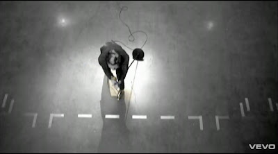
 Also, the high-angle shot down onto the singer is a classic rock music camera angle, and it allows the viewer to show the movement and energy of the singer well. Below are several examples of this, including another shot from the 'Medicate' video, and two other examples: Foo Fighters' 'All My Life' and The Offspring's 'Can't Get My Head Around You', two other modern rock music videos.


What these shots of the singer also show are the wooden boards that we laid on the floor for the shooting, and they really come into the fore in these high-angle shots. They further emphasise the already gritty, quite cold look that has been achieved by the grey concrete of the floor and the colour overlay we implemented. Also, leads and other equipment are sighted in the background of these shots, which gives the viewer a certain spacial awareness - it demonstrates the size of the area that the band are performing in, and by keeping the band relatively close together, it shows an intimacy, unity and tightness to the band and their performance. Below is another high-angle shot which demonstrates this well, showing the drummer and other members.

Another shot relating to the singer is this shot here, showing a close up of the singer and in particular, his mouth. This is another relatively common technique, and further emphasises the emotion and energy evident in the singer's performance. However, we did go against this convention to a certain degree, as it is often more common to show the whole face in a portrait format - in our video, however, we show mainly the mouth, along with parts of the upper body, in order to show the flamboyant movement of the singer's arm in time to the lyrics and the song.

Emotion is prevalent in the other performers too, as this shot of the bassist shouting backing vocals with real vigour demonstrates. This helps to add to the backing vocals and give them more size and energy than normal, even though there is no actual difference to the backing vocals on the song. It embellishes them with more energy, and it keeps a unity to the band by using a similar camera angle as the singer. Below is the shot in question, and below that is an example of this technique in the video for AFI's song 'Miss Murder', where the bassist is shown furiously shouting the 'Hey!' in the chorus section.
This concludes Part 1 of Question 1.


Subscribe to:
Comments (Atom)
