We settled on the idea below as a basis for our cover, as it had the same feelings and themes as perhaps the others, but it didn't maintain as much of a direct link to the lost narrative section in our video, and therefore, it wouldn't have any direct connotations attached to it, i.e. a shot of a person on the edge of a building brings to mind very distinctive ideas, normally about suicide, but the idea below is more free-ranging; viewers can make up their own minds as to what it represents.

We decided that we would use the various filters and tools in Photoshop to artificially create the dramatic rolling clouds we wished to use, as none of the photos we got of real clouds seemed to really do the trick. It was commonly agreed that we wanted to go all-out on the clouds, to create a real darkness and epic vision to them. Also, the fact that they are artificial and not like anything that the viewer is likely to actually see, it increases the element of fantasy - a detachment from reality, further increasing the sense of escapism we were really going for.
As it would look out of place to have real grass and other elements clashing with the artificially-created clouds, we decided to create the entire cover artwork, grass and all, in Photoshop. This is all eminantly achievable, as I will demonstrate below.
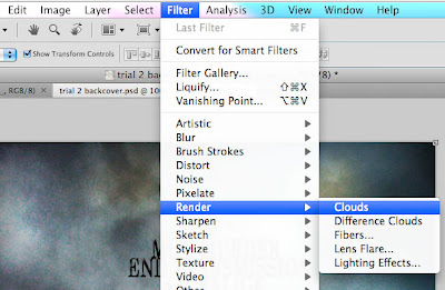
We began on the front cover, by creating the clouds. This was achieved across a number of steps, beginning with using the 'Render > Clouds' tool, as can be seen below.
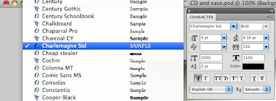
 We also swiftly settled on an appropriate font to be used across not only the album artwork, but the other ancillary task too, to become our house font - Charlemagne ST.
We built up multiple layers of cloud filters and subtly modified them. We also added in extra effects to increase the realistic feel of the clouds, starting with gradient layers to overlay the images below.
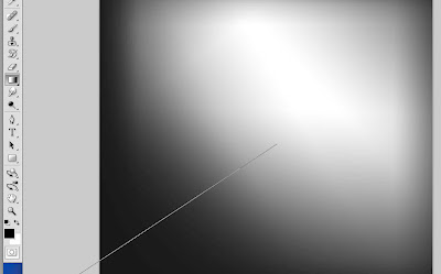
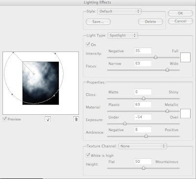
This gradient effect helped create realism by giving the same effect as on real album covers, with light affecting the image. We also tweaked simple settings such as the layer opacities, and in some areas, such as the inner gatefold, we used 'Render > Lighting Effects' to give the sense of light bursting through the clouds.
Below is another menu that we used extensively - the layer types and styles. This was used more to blend the layers that we put over the top of each other together down into one cohesive image.

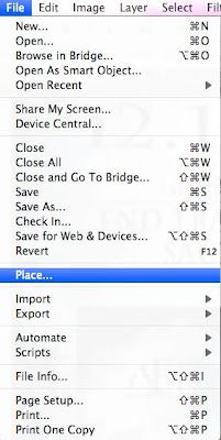
To build up the cloud layers, we did use a few of the real cloud photos to help build up the layers and colours, and we used the simple Place tool to put the pictures onto the file.
More to come...

No comments:
Post a Comment