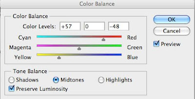
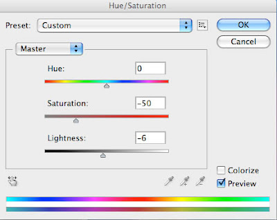
From here we balanced the colour levels and by playing around with these settings, we created the unique dark greys and blues found in the final digipak artwork. Also shown above is the hue/saturation menu, and by taking the saturation down and making a minor reduction to the lightness, the cold feel can be achieved well.
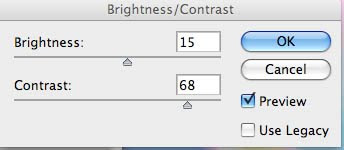
This adjustment was continued into the simple 'Brightness/Contrast' menu option. Similar to the Saturation and Lightness option, when we raised the Contrast highly, we also had to mildly modify the Brightness to match the modification and keep it uniform. The contrast was raised in order to bring out the shadows, and combined with the decrease in saturation (which emphasises the blacks and whites further).
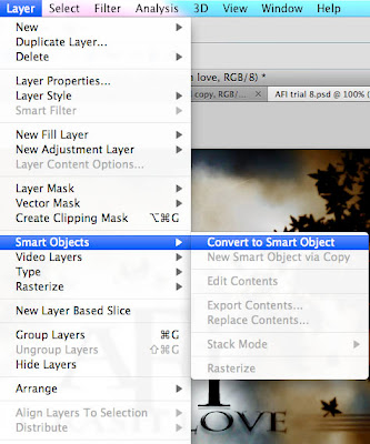
Also worth noting are some practical measures we took to help keep things as simple and as easy to use as possible. This included converting layers to Smart Objects, allowing a series of layers to be edited at once, rather than the standard practice of editing layers once at a time, and the saving down of our workspace to keep things tidy and make sure we could come back to it at any time, and it would be arranged just how we were used to and needed. Below are both of these options as they would appear on-screen.
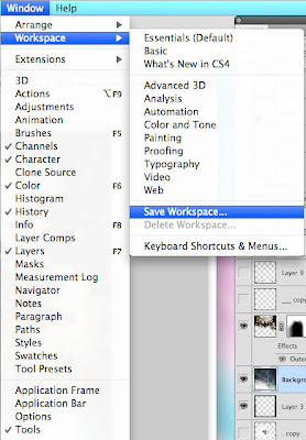
With the colour modifications complete, it's time to work on the other elements involved - namely, the grass, and the fantasy leaves which Mike had the idea of including in the video to further heighten the sense of detached realism and fantasy.
First, here are the steps involved in the creation of the Grass. The Grass option in Photoshop is used as a paintbrush-type tool, so below is the brush preset screen showing the grass option.
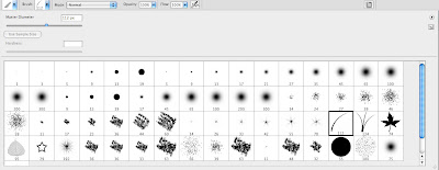
The next few shots look at how we modified the Grass brush for our personal use. We started by modifying the shape of the grass to give it a more wavey, blown-in-the-wind feel to it.
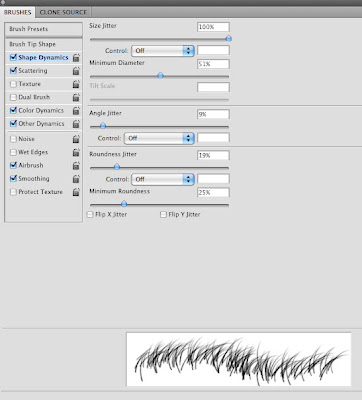
The next stage involves altering the shape further, but also turning the brush into a 'grass clump' brush, meaning that multiple blades of grass are placed down whenever the brush is used, rather than individual blades, which would have been incredibly time-consuming, as you can imagine.
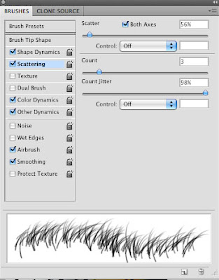
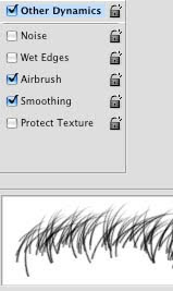
We then utilised other micro filters on the grass to smooth it off and blend it in more with the background and rest of the artwork, before - and this is important - saving it down as a preset option. This saves so much time having to go back and re-do the options exactly if we ever need to use this option again - and in all likelyness we will, for our magazine advert.
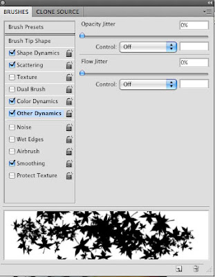
We then simply repeated this process when applying the leaves, as you can see.
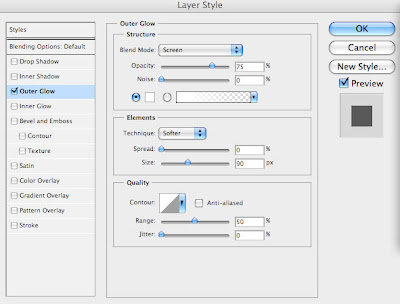
We also used the Layer Styles tool to our advantage, and by applying the Outer Glow (option shown below) to the layer containing the scattered leaves, we created a golden glow to the leaves, further enhancing the mystery and fantasy of the image.
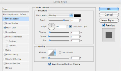
Next, let's look at how we created the text and the AFI logo. This was done by using the Charlemagne ST font, as already outlined, and by applying certain layer styles to it. The Outer Glow effect was subtly used, as well as the Drop Shadow effect shown below.
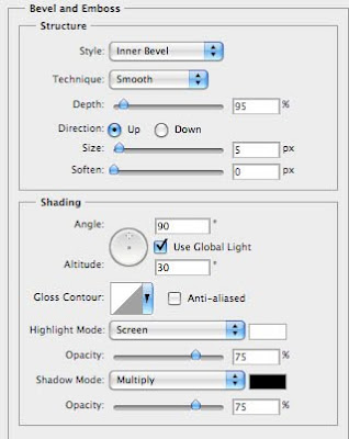
Also, the Bevel and Emboss option in the same menu was used to give the text a 3D quality, and the AFI logo will be made to look like it has been embossed onto the cover to give it a further elegance and sense of realism. Below is the menu screen used to achieved this.
More to come...

No comments:
Post a Comment