Here I will look at the linking characteristics and house style across the three media products and demonstrate just how effective they are at forming a cohesive promotional package, as well as linking together and targeting the desired audience we are looking for, which is largely made up of AFI's existing fans, as well as teenage rock fans in general.
Firstly, I will place side-by-side a screengrab from the finished music video with the front cover of the digipak.
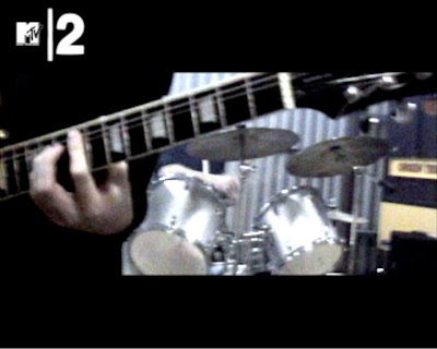
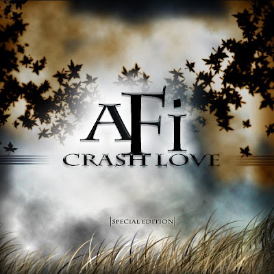
It is when we place the two products side by side that the common style becomes more apparent, and it is mainly in the 'cold' feel to the colours - with the greys and blacks linking together to give a cool, emotionally downing feeling to both products. What is also interesting, however, is how they represent this feeling - the music video uses a bleak, industrial feel to create the feeling of cold emotion, whereas the album cover uses the dark, rolling clouds and almost unlimited space and fantasy setting to give it a dark feel. The industrial, gritty locale of the music video gives viewers and the target audience something to relate to, as such buildings and gritty, urbane looking areas, and the album cover itself acts as a form of escapism for them - the unlimited cloudscape gives the audience and fans free reign as to what exactly it means or represents - for us, we wanted to give the artwork a real feeling of mystery, of escape, of darkness, and of romance to a degree. What is interesting is how the album artwork was influenced heavily by the original plan for the narrative section in the music video, which was eventually canned. What this creates with the album artwork is a sense of narrative in the artwork itself, but instead of having it pre-defined, it simply sets out several themes through the artwork and the title (love, death, fantasy, mystery etc) and is much more open-ended. This also directly appeals to the target audience of young rock fans, as well as appealing to both male and female fans - normally in modern rock, bands can sometimes be often very 'macho' and male-orientated, but we have avoided this issue here.It is also for this reason that we avoided showing the band themselves on the album artwork, instead trading on the content of the lyrics and the music.
The romantic feel of it is further emphasised by the font, Charlemagne ST, which not only matches the look of the artwork but also links closely to the band themselves, who have often used elegant and smart fonts such as this - this therefore links back to the existing fans.
I have yet to mention about the magazine advert so far, and there is a good reason for this - the magazine advert was always going to be an extensive of the album cover artwork. As this may well be the first thing that fans and the audience would see of the new album before actually buying the album, the advert and promotional material needs to give a preview to the audience and prospective viewers of what to expect and what they will find in the new album, and the music video is an extension of that. Below is our magazine advert, and as you can see, it uses the same concept and artwork as the album cover itself.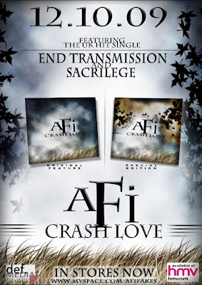
What also must be noted is how we added extra elements into the overall promotion package for the album, which matches real-world practices for it. Below are these examples: the regular, single-CD album cover and the tour poster.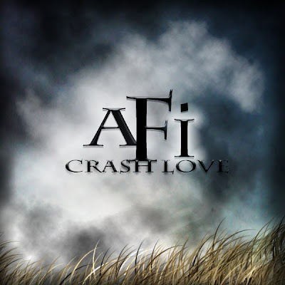
The romantic feel of it is further emphasised by the font, Charlemagne ST, which not only matches the look of the artwork but also links closely to the band themselves, who have often used elegant and smart fonts such as this - this therefore links back to the existing fans.
I have yet to mention about the magazine advert so far, and there is a good reason for this - the magazine advert was always going to be an extensive of the album cover artwork. As this may well be the first thing that fans and the audience would see of the new album before actually buying the album, the advert and promotional material needs to give a preview to the audience and prospective viewers of what to expect and what they will find in the new album, and the music video is an extension of that. Below is our magazine advert, and as you can see, it uses the same concept and artwork as the album cover itself.

What also must be noted is how we added extra elements into the overall promotion package for the album, which matches real-world practices for it. Below are these examples: the regular, single-CD album cover and the tour poster.

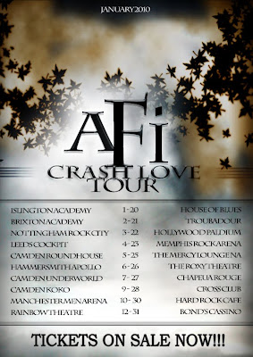
What this does is expand on the mode of address and overall theme, and is commonplace in real album promotion - bands regularly tour in support of albums; indeed, AFI themselves are touring in support of the Crash Love album as I type.
To conclude, I am very happy with the overall image projected by our package, across the three products. The only part I would change is to perhaps add in at least a partial narrative section - it was sad to have to give that section up, and it would help to link the three products further in a narrative sense. But otherwise, I am very happy and proud with how the products have all come out, and am confident they will stand up in a real-world context.
This concludes Question 2.

No comments:
Post a Comment